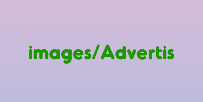
It's the first week of October which means time to start planning holiday promotions. Last year, for my client holiday gifts, I did a bottle of wine with a custom label created by me. After thinking about it for a LONG time, I decided I'd repeat the gift this year. While it's not as eco-friendly as I'd like, the contents are sure to be used and the bottle can be recycled (which I've so clearly typed on the label). This year's holiday label is below:
I wanted something somewhat distressed looking, while classic, elegant and even a little whimsical. The red on the main portion of the label is somewhat retro, while the darker red stripe along the side will match the casing on the wine cork. By only using type, the message is sure to be noticed, thus, the focal point of the label.
Next up is creating a holiday card to match the wine bottle piece. I'll keep you posted...
9.30.2008
This Year's Holiday Wine Label
9.22.2008
Client Work vs. Self-Promotion
13thirtyone is still alive and well. Sorry I haven't written in a week or so. Things are so busy! Lots of new projects and clients are keeping me busy (keep checking my website for an updated client list and new portfolio work) and I'm loving every second of it.
Client work though certainly has been my priority, thus, my self-promotional activities are falling a bit to the wayside. That old saying, "the best time to promote yourself is when you're already busy" keeps rolling around in my head. How am I to juggle this?
I've decided that the best way for me to go about this is to schedule it. Once or twice a week I will have to set aside the time for blogging, or online networking, or creating my monthly email campaign. I'll give it as much priority as I would a client meeting. It's simply a part of running a business that can't be ignored. I haven't quite decided how much time to set aside yet, but I'll figure something out.
Another thing I've been thinking about is also setting aside time each week for "client appreciation." This doesn't mean going shopping and finding cute thank you gifts, but taking a little time out each week to go the extra mile. For example, being sure to write a thank you note to EVERY client after I finish a project. Being sure to write thank you notes (and not thank you emails) to the prospective clients I've recently talked to or met with. Perhaps I come across an article online or in a newspaper that pertains to one of my clients; this is the time to pass that along to show that I've been thinking about them and their project or business. What does this accomplish? I think it shows not only good manners, but it's something I can try to do to separate myself from my competition. I can show my clients a little extra attention, making it clear that I really do care if they work with me and that they are happy.
Are there any self-promotional routines that you are sure to make time for every week? I'm just curious to know if scheduling time into our busy work weeks is how others are handling their marketing and self-promotional efforts.
9.09.2008
Does Your Business Card Need A Facelift?
We all receive business cards all the time. They're everywhere and they're the way our contacts refer us, reach us and even remember us. It's important that your business card not only reflect your company correctly, but also be organized in a fashion that's readable. The following points are provided to ensure you're getting the most from your card.
Material: What better way to have your business card stand out than by not using paper? Just imagine if someone handed you a business card that was printed on cardboard, plastic (recycled, of course), metal or another material. You'd definitely pause to look it over and it certainly would make an impression. Try helping your cards to stand out in the stack by printing on a different material. Plus, you're guaranteed to have a better chance at winning those fishbowl-free-lunch contests always lingering on restaurant counters.
Color: Black and white can be very classy and clean. But how about adding a splash of color? People are visual beings and love to look at color. If your budget doesn't allow for a full-color piece, even a one or two-color card can be more effective and exciting.
Size: The standard 3.5"x2" card is easily accommodated into most Rolodex files and business card holders. However, you can create an interesting shape without sacrificing functionality. Keep the width and try experimenting with different heights. Also, don't be afraid to create a unique size all together. An extremely long business card that can be folded into the typical size can serve as a great mini-brochure.
Shape: If you're considering experimenting with the size of your business card, why not think about shape? Design magazines all over are featuring new and trendy card designs printed in circles and squares. They may not fit into the standard sized holder, but you'll be gaining a definite impression and attention.
Double-Sided: Don't forget about the back of the business card. While it is a little more costly to print on both sides, it's well worth the investment. Think of it as getting double the space! If you have no content you'd like to feature on the back, including an eye-catching pattern or design can be very effective.
Font: No matter the size, shape or color of your business card, nothing is more important than making sure the text is legible. What's the point of printing fancy cards that look great visually, but aren't readable? I recommend no smaller than an 8pt. font if possible be used anywhere on your card. Smaller than that and you're making the reader have to work too hard to see your information.
Overall, business cards are a relatively inexpensive way to market your business. Be sure to get the most bang for your buck by creating a card that's exciting, different and that gives your business the attention it deserves.
9.08.2008
13thirtyone Will Be In Logo Lounge Book 5!
I just found out over the weekend that two logos I designed will be included in the fifth book by Logo Lounge. This is an extreme honor and I'm very excited about it. Logo lounge chooses logos based on industry trends, excellence in typography and overall concept. The two logos that were chosen are as follows:

Ironically, both logo options were not chosen by the client. They both were presented as options, and others were chosen. I designed the top one (The Modern Woman's Divorce Guide) to reflect your modern day woman in bright pink, an very feminine color. The symbolism of her walking over the text shows a longing to move on from the divorce; something the guide is all about.
The Ambiance logo is a fun and flirty mark I created for a small business owner in La Crosse, Wisconsin. The logo can be taken quite literally, in that the text itself is surround with an "environment." On another note, the bright green is taken from a color the store owner had painted her walls with. The playful font is representative of the unique tone of the store, while the floral elements add a feminine touch.
I find that the Logo Lounge series is a great source of inspiration and also helps designers to stay on top of what's going on in the design industry. Previous versions are available from Amazon.com.
9.02.2008
Q & A: Pricing Logos
Every once in a while I get an email from a reader with a question related to one of my articles or blog postings. With the permission of the writer, I thought I'd publish the most recent inquiry. Maybe some could benefit from our conversation.
Writer writes:
Hi there, I found your information online while doing a search on logo design. I love the article you have about the steps you take to design a logo. I'm trying to get my foot in the door with designing logos but I wanted to know if there were actual things I have to consider to determine a correct price for the client. I'd like to charge based on how many hours it takes to design the logo because ive read somewhere that that's what you should do. I just can't determine if I've covered everything I should to determine how many...I'm looking for a guide to go by and would appreciate any help you can offer.
Thank you!
My response:
Thanks for letting me know you liked the article; I appreciate it!
I think pricing is tricky when it comes to design. Not only does it vary from designer to designer, but on the location you're working from as well. I've heard a couple of different theories on how to price logos. Some just go by their hourly rate. Others created a package price. Another way I've heard is to charge a starting base of $500 and then add an additional $100 for each employee the company has. This way, the cost is proportionate to the business. Since logos are the only means of design that can be sold as an asset, they should definitely be priced accordingly.
For myself, I allot myself about 18 hours for research, font selection, design and revisions, plus compiling the logos onto a disc for the client and multiply this by my hourly rate. I have found that sometimes I go a bit over and sometimes I come in under, but having a set price for this particular job makes me feel more comfortable. All other work I do is by the hour. Logos and stationery sets are the only jobs I do that I have a set "package price" for. Also, I find that this end price is competitive with what other designers are charging in my area.
Hopefully this helps. Sorry for being somewhat general and keeping it slightly vague; so many variables go into pricing. Good luck with your design career!
I thought I'd publish this because I get questions from time to time about pricing. Hopefully this will help you out as well!